Google Money Master: The art of designing web scams
"Google Money Master" - sounds cool, huh? And $5000 a month from home (working only 10 hours a week!) doesn't sound bad either. Oh, and this author is from Orange County, too! Great, where do I sign up? Obviously these underlined, blue words are links, so I'll click on one of these. Uh oh, this new page looks like a scam... but Mike Richardson from Orange County said it's legit!
Haha, that's what went through my mind this morning when I hopped on the article from the "Los Angeles Tribune" about a way to make $5000 a month. After sheepishly collecting my wits upon realizing that I had been scammed (no I didn't sign up), I turned back to the page to find out how I was so easily deceived. I looks like scammers (yes, those people capitalizing on unemployed people) are listening in web design class. Here are some ridiculously true principals that I should have caught off the bat, but that seem to catch me (us?) every time:

Localization
First and foremost, the scammers localize the content. The page was created in PHP, which means everytime it's served from the host, it can look at your whereabouts and figure out where you're located at the time of viewing. Mine says "Orange , CA" (notice the extra space after "Orange" - a sign of hasty coding) in two places. And the "Los Angeles Tribune" is not a real newspaper... I'm sure if you're in Houston it will say the "Houston Tribune." We are prone to believe something if it's happening in our back yard.Content
They employed typical hoax content, using a fictitious name, realistic circumstances and a reputable entity (usually a media outlet or law enforcer, this time it's Google). It gives us a creditable source, or at least uses words that seem creditable. It even gives his email: "Tom Chilton@www.Financial-Weekly.com" - It's the first time I've seen "www." in an email's domain. lol This scam even holds true to form in its grammar - poor.Layout
Here's my favorite part. We as web surfers behave very differently in many situations, but in some ways we act exactly the same. Like how we scan documents. As the images above illustrate, our eyes spend a lot of time at the top-left area of the page, and the scammers capitalize on that. The bold, alluring title, the photo of a young work-at-home millionaire... look at the little social networking icons! Looks just like the real thing.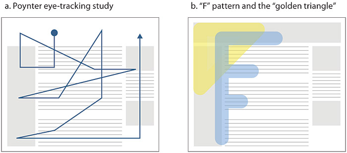 photo from Web Style Guide
Reader Feeback
At the bottom of the page, as all news articles or blogs should, we see a bunch of user comments. Some are skeptical, some affirm our hope that Google will truly send us a check within 48 hours of signing up. What better way to include non-obtrusive peer pressure! Notice the date of the comments happen to be before the "Created At" date, and they all were posted at the same time. And "Created At?" Is that English?Functionality
No no, this is actually my favorite part. Click on the news tabs at the top. Go ahead and login, or post a comment. Or reply to a comment or favorite it, or hover over anything that we web surfers know so well to be links or functional buttons. No little pointy hand, no subtle animation. Not a single link on the entire page, except the handful they want you to click that lead to theirtraphomepage. Ha! This should have been the first warning that this was a fishy site, but just like a skilled magician, they distract you from what they're really doing by directing your attention to a little trick.
Google Money Master: a bona fide folk tale. Pass it on. ;)
![]()

4 comments:
Nice job!
great job. I was skeptical right of the bat. My friend sent me the link, and your posting proves it. These scumbags need to be caught and jailed.
love it.
Comments are closed due to spam.
Post a Comment